Published on the occasion of Richard Estes: Urban Landscapes,
on view at the Portland Museum of Art
May 14 - November 28, 2021

Richard Estes (United States, born 1932), Manhattan, 1981 (detail), from the series Urban Landscapes No. 3, screenprint, 19 3/4 x 27 5/8 inches. Private Collection. Image courtesy of Luc Demers. © Richard Estes
“My pictures are what I have to say, they are my statements.”
–Richard Estes, 2021
Foreword
Richard Estes, whose works are always identifiable by their focus, is America’s premier Photorealist painter. There is always a spirit revealed in the images that is quintessentially Estes; Is it the cool detachment, the linear structure, the color, the obsession with detail, or the depth of precision? Or is it how he encapsulates a moment frozen in time that will never disappear but changes depending on what experiences the viewer brings to the image?
Many museums have relationships with artists that reflect the artistic vision of the museum and community. The PMA and Richard Estes have a very close and trusting relationship and we are very proud of our 1991 and 2014 Estes exhibitions, which were beloved by our audiences. In 2021 we present the first comprehensive series of exhibitions of his silkscreen prints of urban landscapes, captured originally in photographs by the artist. The imagery is mostly void of people—a cityscape that is true to urban life before the city rises every morning. This void is also reflective of the wonders of urban life, in which one can feel anonymous yet be among hundreds of thousands of people. Imagine yourself on New York City’s D train, getting to work early, walking home from a late night that has not ended, or sauntering out early for a cup of coffee as your neighbors just begin to go to work—the images are experiential, not static, and Estes activates the flat picture plane with hundreds of layers of inks and colors in various finishes.
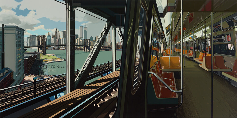
Estes’ giant print D Train draws you into the image physically, phenomenologically. Everything is in equal focus, the colors add dimensionality and texture, and the horizon lines and perspectives transport you to the locale. One almost feels like you are standing in the D train overlooking the Manhattan Bridge, peering down the East River from Brooklyn toward lower Manhattan and the Brooklyn Bridge. It could be no other place but New York City. Estes has stopped the subway in time, capturing its structural details and preserving its energy, much like a snapshot, instead of viewing it as blurred when observed at normal speed. Estes encourages the slow act of looking and relooking. Here, our vantage point in the subway carriage records a city’s past as well as many memories of this place. I see the World Trade Center as it was in 1988—the symbol and most common cinematic trope of New York City before 9/11. Be patient with these prints and let your eye wander to find the multiple layers of visual experience and color.
We are grateful to Richard Estes for his support and care of the PMA for many years and are thrilled to share these magnificent prints that have rarely been seen. His art plays a key role in the stories we tell at the PMA. Living in New York since the 1960s, Richard has had a home in Maine since 1975 and became a Maine resident around 1980. These pictures enable us to view the apex of realist prints and to slow down and view what is right front of us.
Mark H. C. Bessire,
Judy and Leonard Lauder Director
Richard Estes working on D Train at Edition Domberger. Image courtesy of Edition Domberger.
Richard Estes’ Built Environments
Richard Estes (United States, born 1932), D Train, 1988, screenprint, 42 1/8 x 77 inches. Private Collection. Image courtesy of Luc Demers. © Richard Estes
Richard Estes has been celebrated for more than 50 years as the premier realist painter of American cityscapes, yet he also deftly rendered his photographic views of urban spaces through printmaking. From the 1970s through 1990s, Estes and Domberger created dozens of highly sophisticated prints, including the portfolios Urban Landscapes No. 1 (1972), Urban Landscapes No. 2 (1979), and Urban Landscapes No. 3 (1981) and a handful of oversized prints such as Holland Hotel (1980) and D Train (1988). Although his prints may be lesser-known works, they rival his realist paintings in both complexity and subject matter. Screenprinting achieves uniform and intense effects like no other printing process because of its ability to evenly print layers of inks and colors with various finishes (translucent, opaque, glossy, matte, etc.). This essay and the accompanying exhibition recount Estes’ fluency in printmaking and confirm his unwavering dedication to the urban landscape.
Estes is considered one of the founding Photorealists, a group of artists who used photo-based techniques to achieve hyperrealist effects. His technical mastery and devotion to traditional easel painting set him apart from other Photorealist painters, who often replicate the image by projecting it onto the canvas. Estes only paints or makes prints of subjects that he saw or photographed in person.
Richard Estes (United States, born 1932), Bus with Reflection of the Flatiron Building, 1967-1968, oil on board, 36 x 48 inches. Private Collection. Image courtesy of Luc Demers. © Richard Estes
Bus with Reflection of the Flatiron Building, for example, is his first mature painting that is created from multiple pictures. “A photograph is just values,” said the artist. “It doesn’t have line. When you use the photograph, you are using the values, but you are adding line and space and movement, coming from your own experience. That’s why although I work from photographs, I like the subject to be things I’m really familiar with. I don’t think I could use someone else’s photograph of some place I’ve never been to and making a painting.”ⁱ In Bus with Reflection of the Flatiron Building, a young man curiously peers out of a bus into a bustling street, where the Flatiron Building is reflected in a nearby car’s rear window. The scene is located at the crossroads of 23rd Street, Fifth Avenue, and Broadway in New York City. Here, Estes depicts the city in the way its inhabitants experience it—at street level.ⁱⁱ
Estes utilizes the photographic image as an opportunity to develop very precise sketches and then paint (or print) them.ⁱⁱⁱ For each painting or print, he combines multiple photos, constructing his compositions in underpaintings or gouache on paper studies for future screenprints. Estes takes artistic liberties by adding or subtracting details such as buildings, cars, signs, and other architectural details. The cityscapes are composed of multiple perspectives, further removing its visual image from its exact location. The finished work is thus an invention of the artist’s mind.
Richard Estes working on a gouache study at Edition Domberger. Image courtesy of Edition Domberger.
In 1971, Robert Feldman of Parasol Press Ltd. commissioned the artist, per the suggestion of his friend and art dealer Allan Stone, to produce a print portfolio. Estes first tried the lithographic process at Mourlot Studios, a prestigious workshop established in 1852 in Paris, France. The artist sublet his New York apartment and rented a place in Paris. Lithography, however, did not allow him to render a “photographic” view in print, so Estes decided silkscreening lent itself more appropriately to his working methods.ⁱᵛ The artist left Paris for Stuttgart, Germany, where he sought the screenprinting expertise of Edition Domberger, a graphic print studio with over six decades of experience.ᵛ According to Lindsay Griffith, Christie’s International Head of Contemporary Editions, “They [Edition Domberger] understood that artists used printmaking to experiment and to work within a community. They pushed screenprinting to the absolute limit of what can be done in terms of complexity and precision.”ᵛⁱ
Michael Domberger, the son of the studio’s founders, likened the relationship of working with Estes to being “the artist’s third hand.”ᵛⁱⁱ Estes was on-site for weeks at a time, where master printers and assistants provided technical aide throughout the printing process. Together they found a unique working relationship to mirror the photographic precision of his paintings. Estes’ untraditional screenprinting approach was more akin to his painting process. He painted compositions in acrylic or gouache on paper or board that he gave to the master printer, who would photograph them and translate them into flat shapes and colors. Once the screens were set in the printer, inks were used one at a time to bring the image to life. Sometimes over 200 colors were used in a single print. Estes reviewed trial proofs for each print and offered instructions for shifts in values and color. The printers handled the technical aspects. Though the process of making a single print was laborious, it was also deeply collaborative.
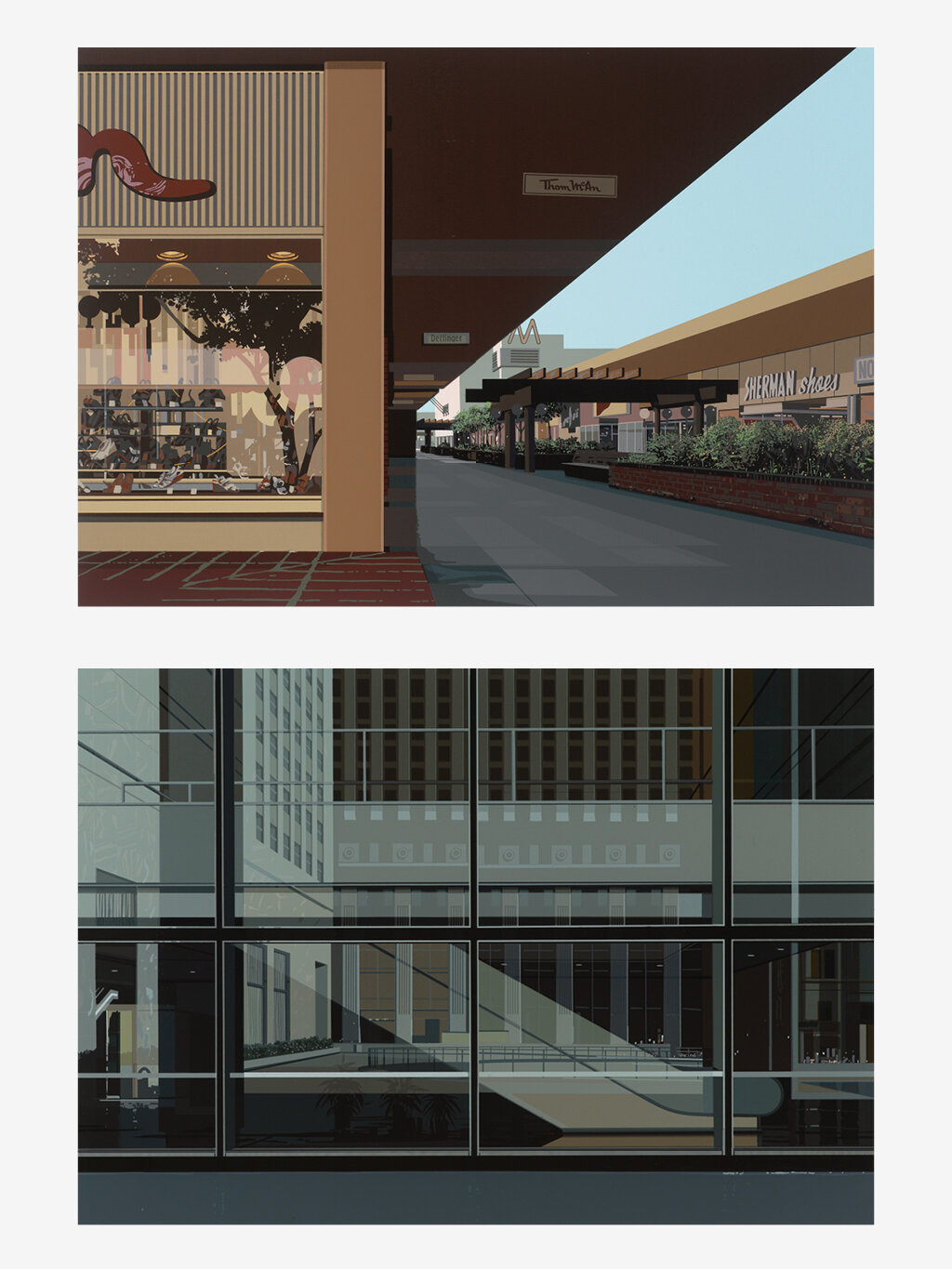
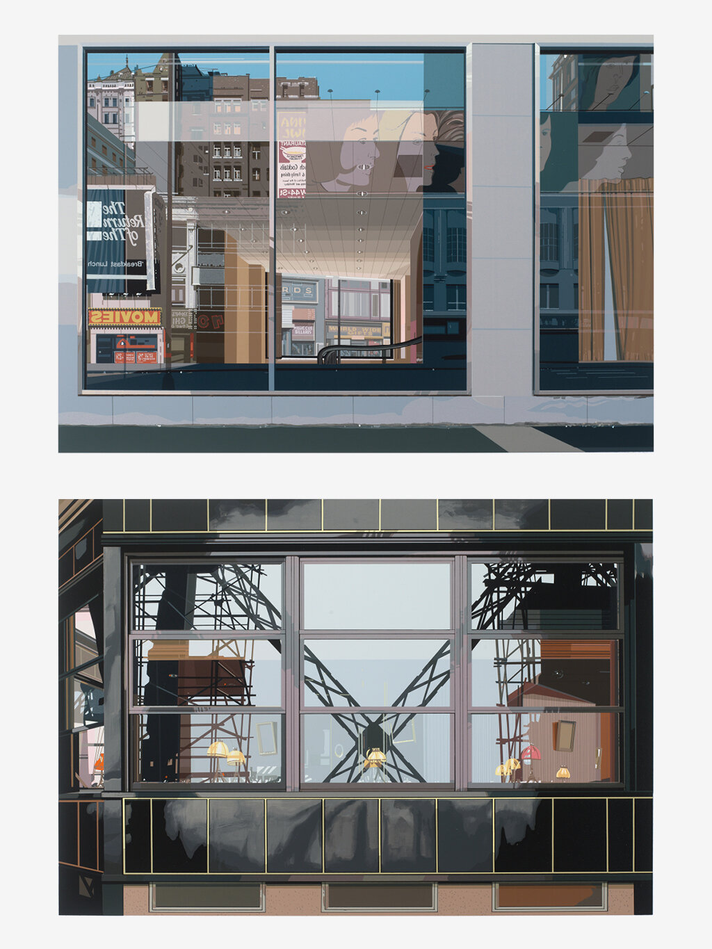
The complete portfolios of Urban Landscapes No. 2 (1979) and Urban Landscapes No. 3 (1981), both of which are on view in the two rotations of the PMA exhibition Richard Estes: Urban Landscapes, trace Estes’ travels from New York to Venice, London, San Francisco, and Germany and highlight his acute observations of urban environments. Each portfolio consists of eight prints and features both exterior and interior views. At times, Estes portrays empty scenes of airports and train stations. At others, he focuses on the rich façades of storefronts, supermarkets, and movie theaters from around the world. Estes shifts the orientation of the sheet of paper in each portfolio; pictures in Urban Landscapes No. 2 are vertical while those in Urban Landscapes No. 3 are horizontal images.
Richard Estes (United States, born 1932), Picadilly Station, 1979, from the series Urban Landscapes No. 2, screenprint, 27 1/2 x 19 5/8 inches. Private Collection. Image courtesy of Luc Demers. © Richard Estes
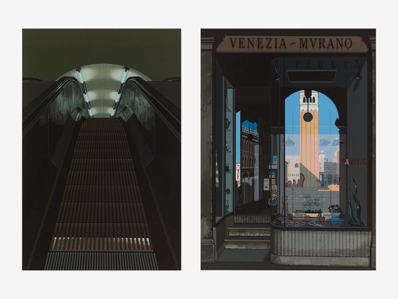
In Urban Landscapes No. 2, Estes masters how to translate complicated reflections into print. He finds the gleaming, reflective surfaces of New York City irresistible. In this portfolio, his manner of printing reflections on metal and glass surfaces displays astounding technical skill. Shiny surfaces and reflections are abundant in Estes’ portrayal of a downward escalator in the print Picadilly Station, an underground tube station in London, England. The fluorescent glow of the overhead lights bounces off the escalator’s metal panels as its steps change in depth ever so slightly, pulling the viewer into the confined space. Michael Domberger shared some anecdotes about the printing process of Picadilly Station: “Estes wanted the lights on the ceiling of the escalator tunnel to be printed in halftones. Our experience in printing pictures with the extremely fine 60 grid for screen printing came to the rescue. Due to the rough surface of the paper, the raster point could only be seen with a magnifying glass, in the graphic arts this instrument is called a thread counter. Richard Estes was enthusiastic about this result.”ᵛⁱⁱⁱ
Richard Estes (United States, born 1932), Venezia-Morano, 1979, from the portfolio Urban Landscapes No. 2, screenprint, 27 1/2 x 19 5/8 inches, Private Collection. Image courtesy of Luc Demers. © Richard Estes
Venezia-Murano, an archetypal Italian storefront, is an impressive screenprint of no fewer than 96 colors.ⁱˣ The viewer is positioned in front of the store, standing in the arcade, perhaps admiring the glass collectibles in its interior window display. The reflections within the door and window illustrate how Estes captures the essence of the principal public square in Venice. The arch of Italian architecture reveals what is beyond the arcade—blue skies, St. Mark’s clocktower, and duomos in the distance. Curator Patterson Sims argues that Murano Glass, a painting of a similar subject created three years prior in 1976, is his “most intriguing and multifaceted window reflections of what is beside, behind, and beyond the viewer.”ˣ Estes employs similar techniques to encompass the viewer in the print Venezia-Murano.
Movies, in Urban Landscapes No. 3, is another print of complex reflections. Like Venezia-Murano and other prints, Estes blends interior and exterior spaces into a single picture. Upon close inspection, three different spaces are rendered in a singular image. The lettering on various signs offers visual cues to decipher the scene. First, the building’s exterior is suggested by grey concrete walls on the sheet’s edge that frame two oversized windows. Within the windows’ reflection is a street scene: a movie theater, a billboard of a woman’s profile recalling the work of painter Alex Katz, and buildings and brownstones in the distance. Next, the windows reveal the building’s lobby, complete with curtains, an escalator, and a shallow ceiling and overhead lights. Lastly, windows on the opposing side of the lobby expose a billiard hall and gift store on a nearby street. Once again, Estes accomplishes a multidimensional picture on a two-dimensional surface to highlight what’s “beside, behind, and beyond the viewer.”
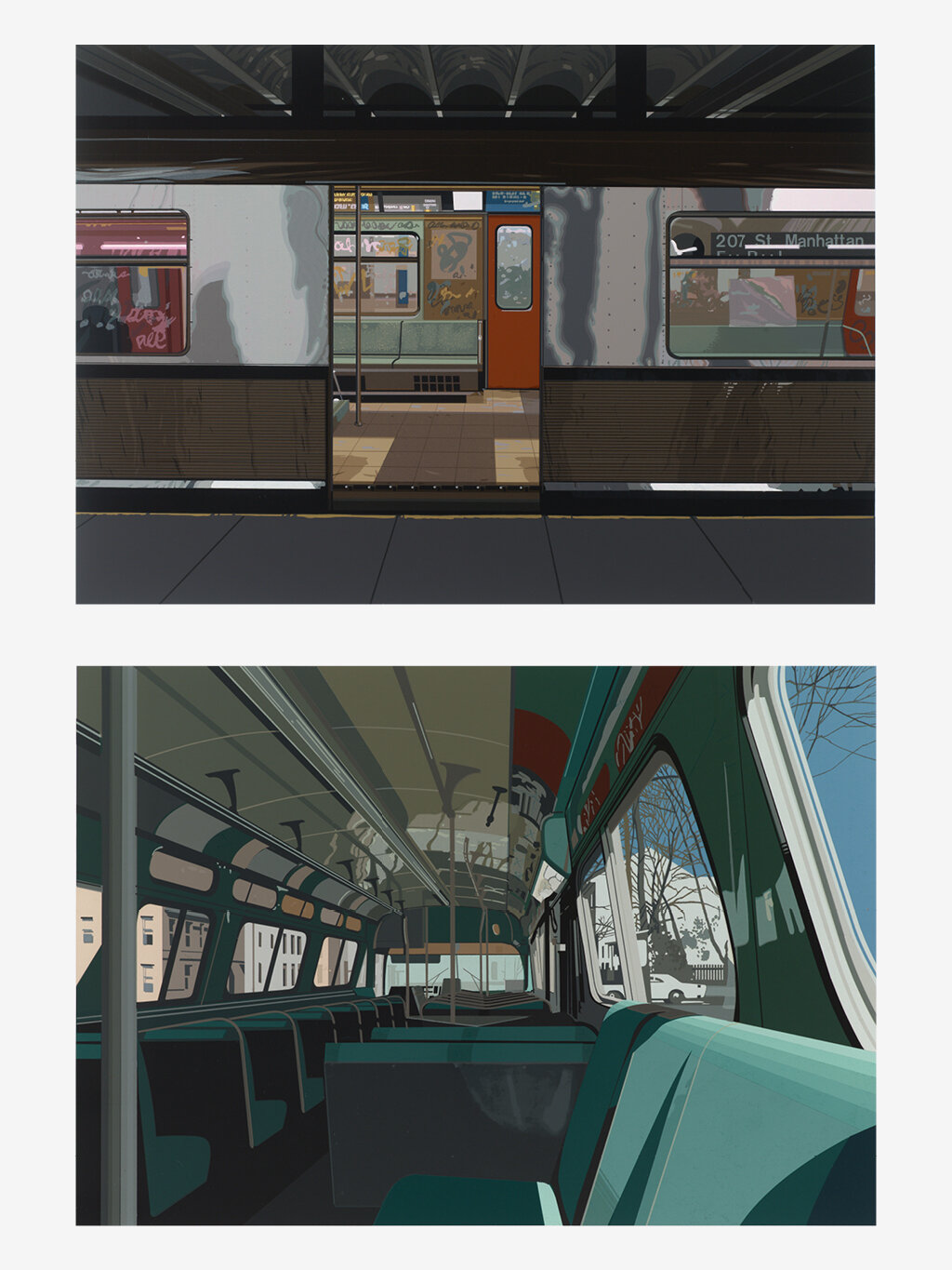
LEFT: Richard Estes (United States, born 1932), Bus Interior, 1981, from the portfolio Urban Landscapes No. 3, screenprint, 24 x 29 1/2 x 1 1/2 inches, Private Collection. Image courtesy of Luc Demers. © Richard Estes.
RIGHT: Richard Estes (United States, born 1932), Trial proof of Bus Interior, 1981, from the portfolio Urban Landscapes No. 3, screenprint, 20 1/4 x 27 9/16 inches, Private Collection. Image courtesy of Luc Demers. © Richard Estes
Bus Interior, also in Urban Landscapes No. 3, is a continuation of his interior-exterior investigations. In it, orderly rows of aqua seats and chrome frames dominate the image. The viewer is presumably seated in the back of the bus, a prime location for expansive views of the city as it passes by. Estes preserved a trial proof of Bus Interior that documents how layering of inks build this image. In this proof, a critical eye might detect missing details, such as signage, handrails, and poles, and the properties of polished chrome, found in the final print. This comparison of trial proof to final print provides an additional way to understand the intricacies of screenprinting.
Estes was very particular about each print’s construction and worked side by side with the printers. Michael Domberger recounted the specifics of working with him on Cafeteria, Vatican:
Richard Estes (United States, born 1932), Cafeteria, Vatican, 1981, from the portfolio Urban Landscapes No. 2, screenprint, 19 3/4 x 27 5/8 inches. Private Collection. Image courtesy of Luc Demers. © Richard Estes
“There was always some memorable event that was indelibly remembered. The sheet ‘Cafeteria Vatican’ was actually as good as finished when Richard Estes came into the studio one morning and made it clear to us that the dome must be moved 2.5 cm to the right in the large picture on this page, top left!
Our printer Günther Kricke could not believe this, for several days he had only printed 12 colors for this dome. Richard Estes’ wish simply meant: All of this again. Specifically: The corresponding picture corner had to be overprinted with high-opaque silver and the dome had to be rebuilt in many individual steps. And that’s exactly how it was done. On closer inspection, the contours of the original dome can still be seen slightly raised in the blue surface. Thanks to the enormous opacity of the printing inks used at the time, the correction was almost imperceptible.”ˣⁱ
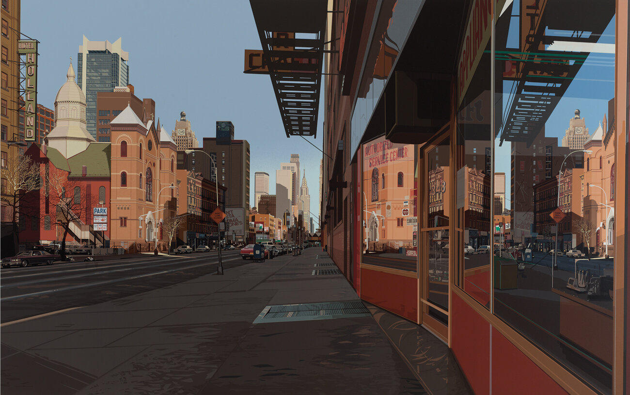
Reflecting on the print Holland Hotel, Michael Domberger commented, “This large format, however, exceeded all of the works we have produced so far. The artist and we broke new ground, through the size of the picture and the number of colors. . . .Little did we know that this time it would be 128 colors.”ˣⁱⁱ Holland Hotel is a single-point perspective of 42nd Street, looking east from 9th Avenue, in New York City. The print is also based off a painting of the same size and title. Its title is borrowed from the neon sign on the building on the extreme left of the image. Estes once wrote about Holland Hotel, “I can think of no significance in my choice of location or subject other than the fact [that] it struck me as visually interesting. The contrasting styles of architecture, the orange late in the afternoon colors. The diagonal construction of the shop window thrusting the perspective in different directions.”ˣⁱⁱⁱ
LEFT: Richard Estes (United States, born 1932), Holland Hotel, 1980, screenprint, 44 1/2 x 69 1/2 inches. Private Collection. Image courtesy of Luc Demers. © Richard Estes
RIGHT: Richard Estes with printers at Edition Domberger and the screenprint Holland Hotel, 1980. Image courtesy of the artist.
In both his paintings and prints, Estes portrays the city as a symbol of American life. Vacant storefronts, shopping malls, restaurants, bridges, and subways are his primary subjects. Estes’ detailed views of New York City and other sites in Italy and Germany remain vibrant records of urban topography. He renders some of the busiest places in London, Italy, and New York, yet the human figure is always absent. Estes’ urban landscapes feel eerily familiar in light of the 2020 global pandemic; today, the imagery is also a stunning reminder of the important role of our many public spaces and the longing to visit them once again. As his subjects hover between past and present—some signage and buildings remain, and some have been demolished or replaced. Nonetheless, the prints of Richard Estes retain their vitality despite the everchanging façades of urban landscapes.
Jaime DeSimone
Robert and Elizabeth Nanovic Curator of Contemporary Art
ⁱ Richard Estes quote found here.
ⁱⁱ Patterson Sims, “Richard Estes’ Realism,” in Richard Estes’ Realism Portland Museum of Art, Maine [May 22 - September 7, 2014], Smithsonian American Art Museum, Washington, DC [October 10, 2014 - February 8, 2015]. New Haven: Yale Univ. Press, p. 9.
ⁱⁱⁱ Ibid, p. 19.
ⁱᵛ Click here for more information about Estes’ shift to screenprinting.
ᵛ Edition Domberger was first “established in the 1950s by Karin and Luitpold Domberger, and was later taken over by their son Michael. Luitpold, who trained as a graphic designer, made his first screenprint using a lady’s silk stocking in 1948. Two years later, he started printing for the German modernist Willi Baumeister, opening his own studio shortly afterwards.” Click here for more information.
ᵛⁱ Ibid.
ᵛⁱⁱ Michael Domberger of Edition Domberger email correspondence with author, February 16, 2021.
ᵛⁱⁱⁱ Ibid.
ⁱˣ Ibid.
ˣ Sims, “Richard Estes’ Realism,” p. 16
ˣⁱ Michael Domberger of Edition Domberger email correspondence with author, February 16, 2021.
ˣⁱⁱ Ibid.
ˣⁱⁱⁱ Letter from Richard Estes to the Tate’s cataloguer postmarked 23 January 1988. Click here for more information.
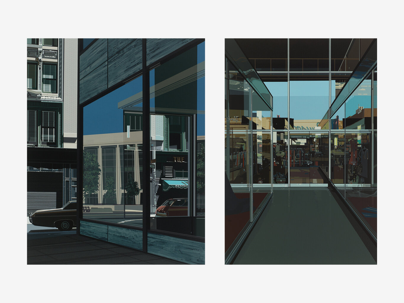


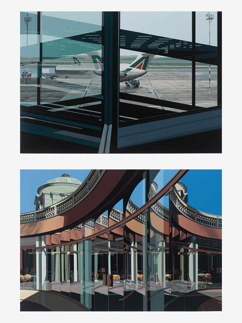


PLATE LIST
From the portfolio of Urban Landscapes No. 2
Slide 1 (left to right)
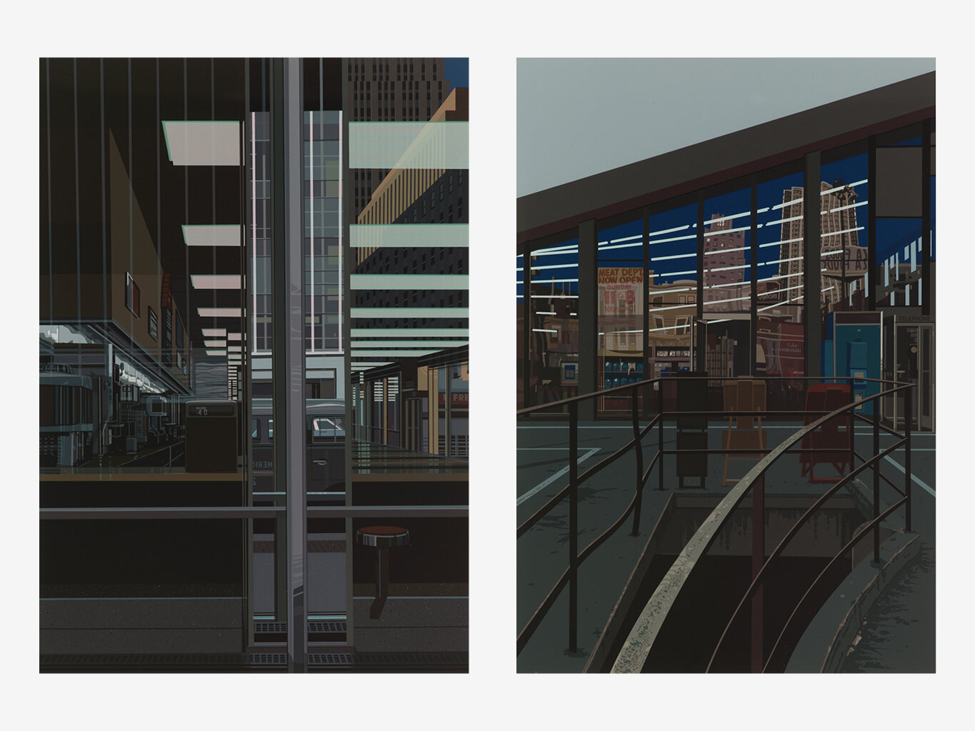
The Ginger Man, 1979, screenprint, 27 1/2 x 19 5/8 inches
Big Diamonds, 1979, screenprint, 27 1/2 x 19 5/8 inches
Slide 2 (left to right)
Chock Full O’Nuts, 1979, screenprint, 27 1/2 x 19 5/8 inches
Supermarket, San Francisco, 1979, screenprint, 27 1/2 x 19 5/8 inches
Slide 3 (left to right)
Picadilly Station, 1979, screenprint, 27 1/2 x 19 5/8 inches
Venezia-Morano, 1979, screenprint, 27 1/2 x 19 5/8 inches
Slide 4 (left to right)
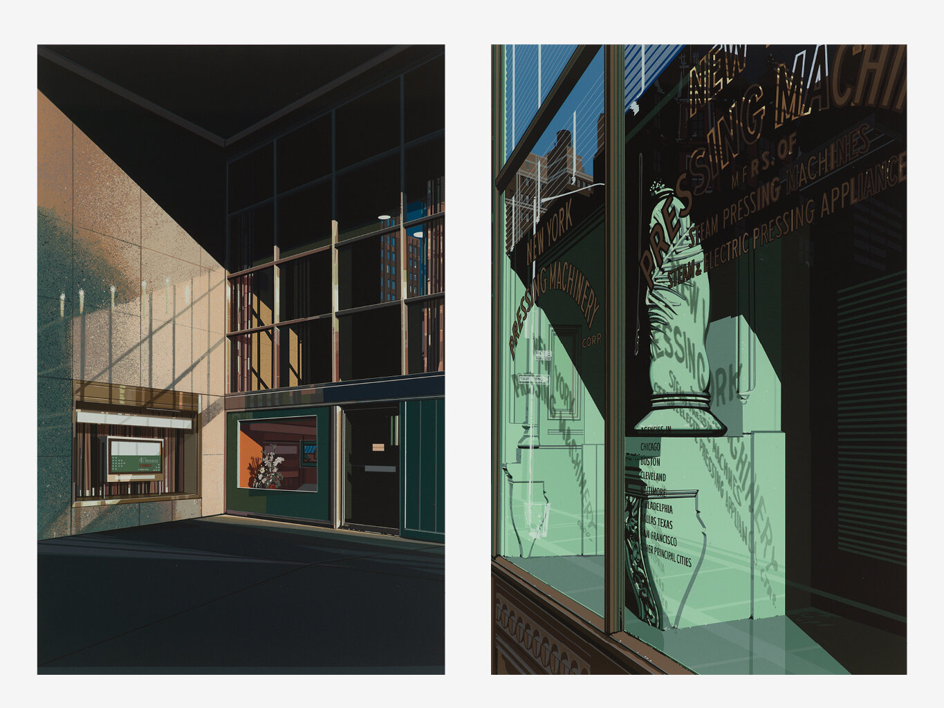
4 1/2% Interest, 1979, screenprint, 27 1/2 x 19 5/8 inches
Pressing Machinery, 1979, screenprint, 27 1/2 x 19 5/8 inches
From the portfolio of Urban Landscapes No. 3
Slide 5 (top to bottom)
Lakewood Mall, 1981, screenprint, 19 3/4 x 27 5/8 inches
Manhattan, 1981, screenprint, 19 3/4 x 27 5/8 inches
Slide 6 (top to bottom)
Flughafen (Airport), 1981, screenprint, 19 3/4 x 27 5/8 inchesCafeteria, Vatican, 1981, screenprint, 19 3/4 x 27 5/8 inches
Slide 7 (top to bottom)
Movies, 1981, screenprint, 19 3/4 x 27 5/8 inches
Eiffel Tower Restaurant, 1981, screenprint, 19 3/4 x 27 5/8 inches
Slide 8 (top to bottom)
Subway, 1981, screenprint, 19 3/4 x 27 5/8 inches
Bus Interior, 1981, screenprint, 24 x 29 1/2 x 1 1/2 inches
Slide 9
Holland Hotel, 1980, screenprint, 44 1/2 x 69 1/2 inches
Slide 10
D Train, 1988, screenprint, 42 1/8 x 77 inches
How to Screenprint like Richard Estes
Screenprinting is a printing technique in which ink is transferred onto an object through a mesh screen. Stencils are designed to block off areas where the ink cannot pass. For each color used, a separate screen must be created to apply each layer of ink. Screenprinting is also called silkscreen because silk was traditionally used in the screen. Currently, it is more common to use synthetic threads.
Richard Estes’ screenprinting approach was non-traditional and more akin to painting.


